01 / Logo
CASE 09 / Industrial SaaS · Art direction · Product
Make visual support legible from the field to the help desk.
SCOPE / OWNERSHIP
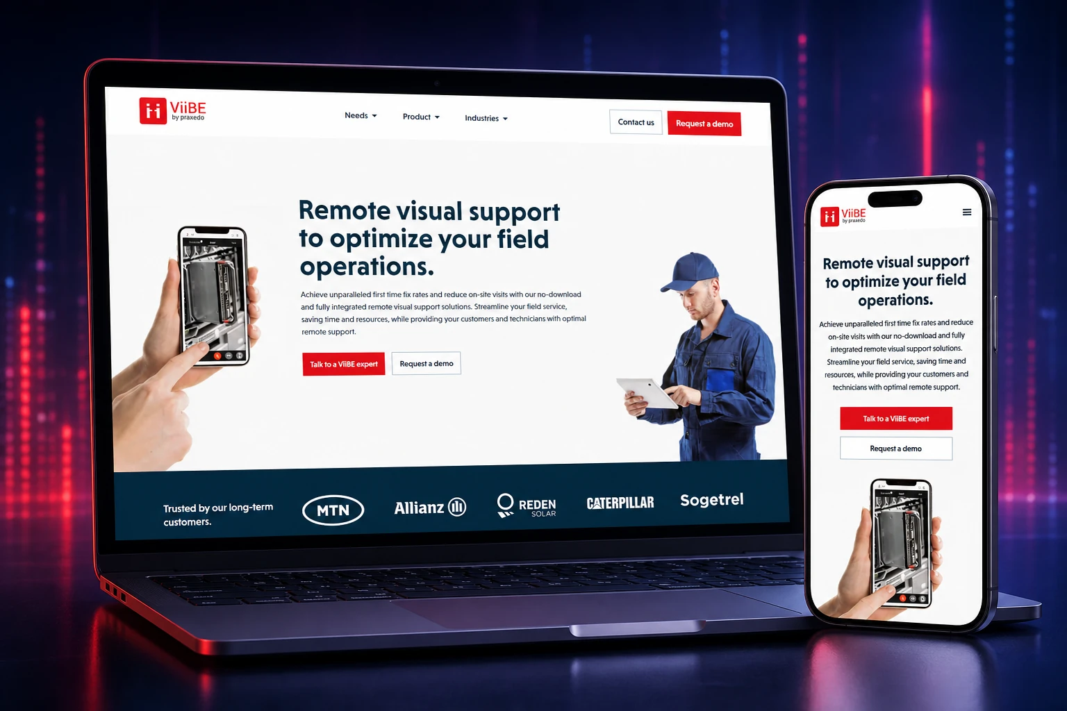
At ViiBE, I shaped the identity, web app and material used to explain the product to operations, sales teams and partners.
01 / The challenge
02 / My approach
I organized the story around five observable actions: call, document, schedule, reassign and share. I then carried those anchors through the web app, campaigns, integrations and video.
03 / Visual identity
I created the ViiBE logo around a simple gesture: two people reaching out to shake hands while also forming the two ‘i’ letters in the name. Orange focuses attention, while the vertical lines extend this idea of direct communication.
01 / Logo
02 / Palette
Direct
#EA202CProduct
#3E3789Interface
#ECEFFFDepth
#0A2D4004 / Evidence & scope
documented public product films
illustrated integrations: Outlook, Zendesk
in-house experience at ViiBE
05 / Design decisions
Calling, annotating, documenting and sharing provide a more concrete structure than general collaboration claims.
The V4 campaign shows the ticket, calendar and reassignment flows directly, connecting message and interface.
The web app, sales material, integrations and films retain the same brand anchors across different formats and audiences.
06 / Delivery
Delivered between 2019 and 2021: ViiBE V4 interfaces and campaigns, Outlook and Zendesk integration material, plus three public films covering ViiBE Report and the IBM Maximo integration.
Capabilities
07 / Production archives
The visuals below are production archives documenting interfaces and communication material delivered during that period.
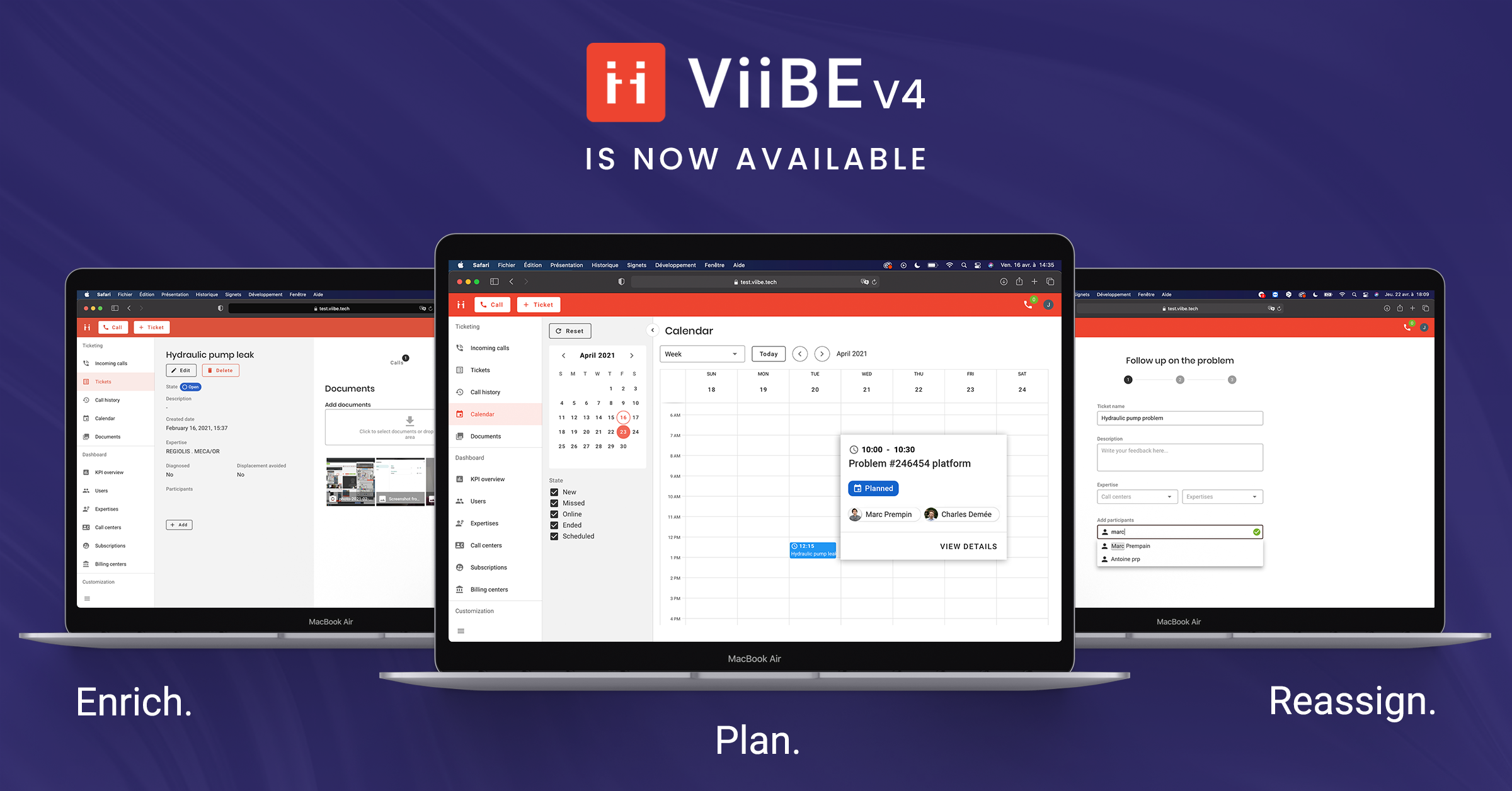
ViiBE V4: ticket, scheduling and reassignment brought together in one product campaign.
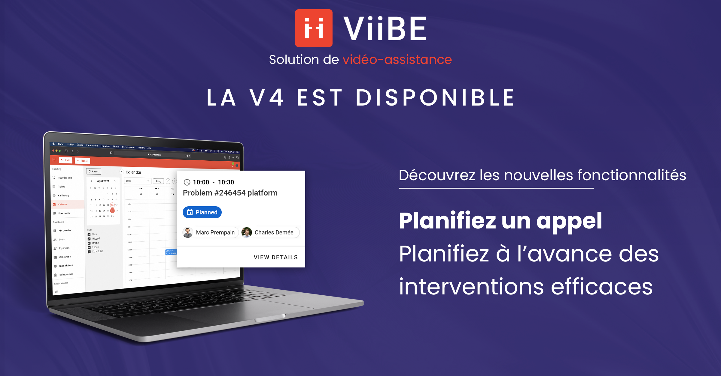
V4 launch: turning scheduling into a clear campaign message.
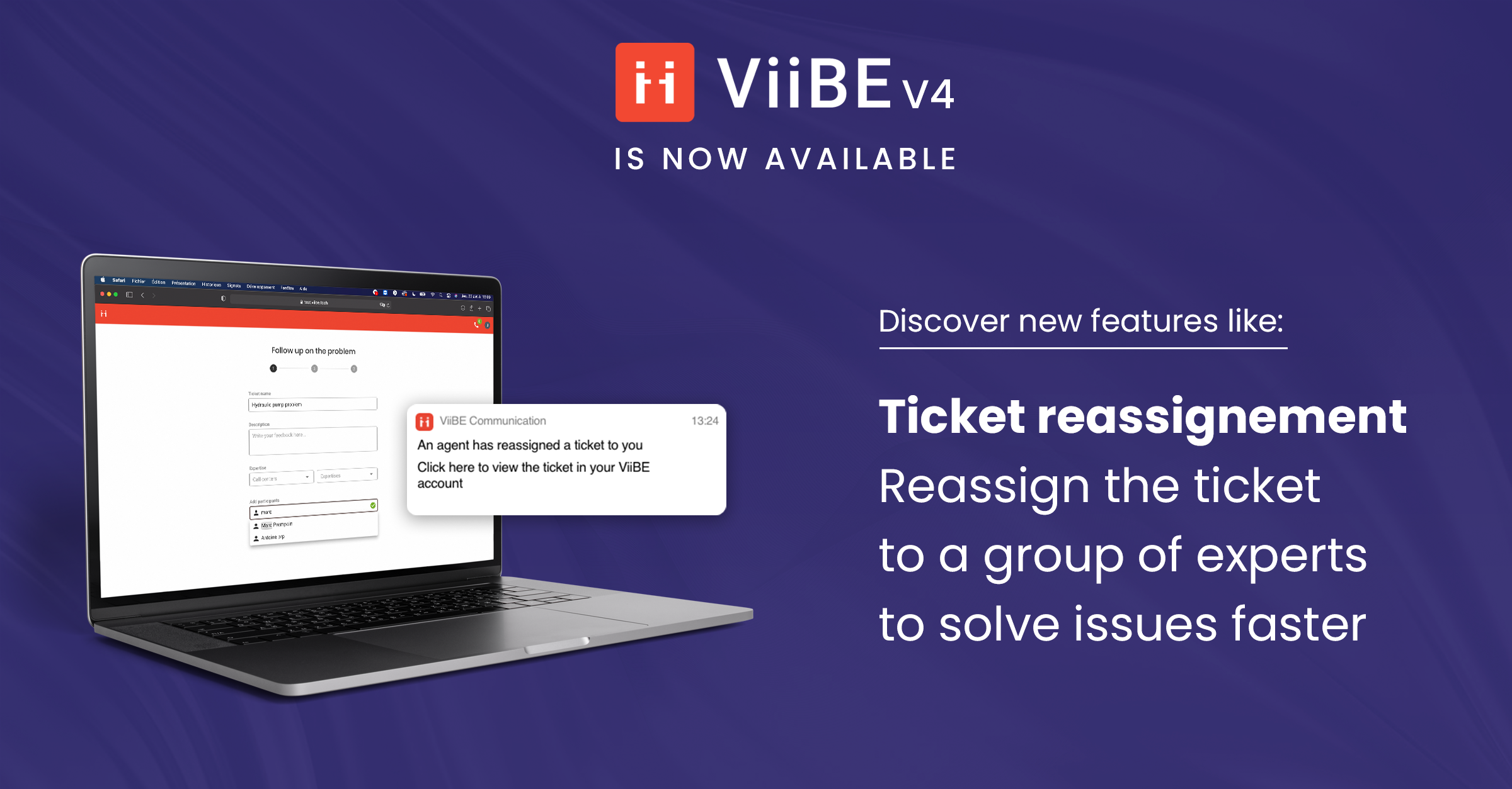
V4 launch: visual support for the ticket-reassignment flow.
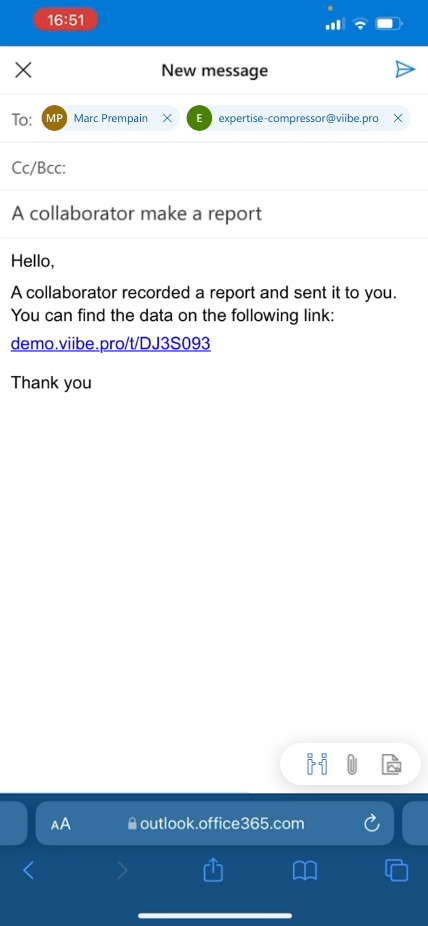
Outlook integration: sharing a report from the email workflow.