01 / Logo

CASE 04 / Web3 · Branding · Product design · UX/UI
Turning wallet history into a performance story.
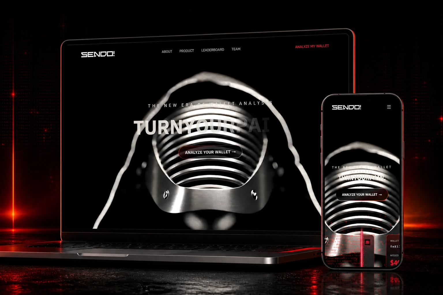
SCOPE / OWNERSHIP
I designed Sendo.Market’s identity and experience: a Web3 product that reconstructs buys, sells and ATHs to reveal the value left on the table.
01 / The challenge
02 / My approach
I built the experience around one clear idea: measure the gap between conviction and execution. The black, white and red direction, central character and data modules give that missed potential a memorable shape.
03 / Visual identity
I gave Sendo a more radical presence than conventional marketplaces. The extended logo, red contrasts and dark imagery create a world between fashion, gaming and Web3.
01 / Logo
02 / Palette
Signal
#FF223BEnergy
#FF5C1ANight
#141414Depth
#4A0C1304 / Evidence & scope
core product modules
reconstructed events
to start the analysis
05 / Design decisions
Missing ATH becomes the core metric: a simple reading of lost potential reconstructed per token and across the entire wallet.
The character, burning cards and scanner language turn technical analysis into a recognizable, emotional experience.
Wallet Analyzer, Pain Card, leaderboard, marketplace and worker reuse the same components and progression logic.
06 / Delivery
Delivered: a cohesive identity, an immersive landing page and a product system connecting wallet analysis, Missing ATH calculation, Pain Cards, rankings and marketplace flows.
Capabilities
07 / Production archives
The product film and brand applications show how one universe moves consistently across motion, digital and physical formats.
Product film combining AI video generation, motion design and post-production to establish the Sendo.Market universe.
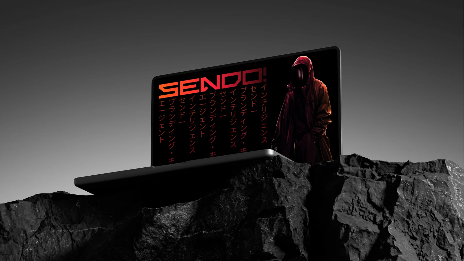
The visual language connects the central character, angular typography and mineral textures in a digital application.
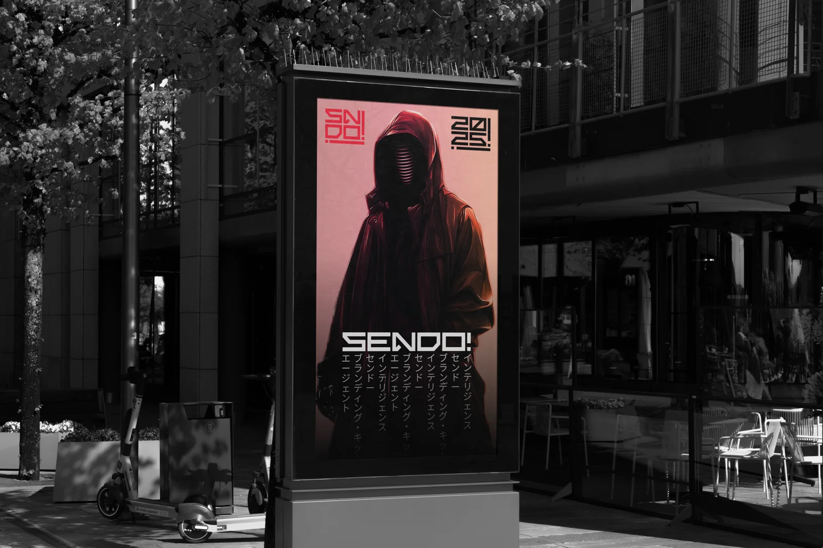
The outdoor application translates the brand’s black-and-red tension into an immediately recognizable physical format.