01 / Logo
JH / LOADING
CASE 02 / Hospitality · Art direction · UX/UI
I transformed a rental store into an estate experience.
SCOPE / OWNERSHIP
I transformed the Les Terres de Gaalon retail website into an editorial experience centred on the estate, with restrained art direction and a cinematic arrival led by video.
01 / The challenge
02 / My approach
I separated stays from private events, defined a shared visual language and organized content around the place, its dwellings and requesting access. The hero sets the tone on arrival, then each section continues the story.
03 / Visual identity
I preserved the official logo and focused the system around three tones: warm ivory, sage and deep green. Newsreader gives large headings an editorial presence, while DM Sans structures the body copy.
01 / Logo
02 / Palette
Ivory
#EBEADESage
#C1C9B9Deep green
#32443104 / DESIGN
Every choice supports the same intention: reveal the estate progressively, from the first arrival to the details of each dwelling.
STARTING POINT
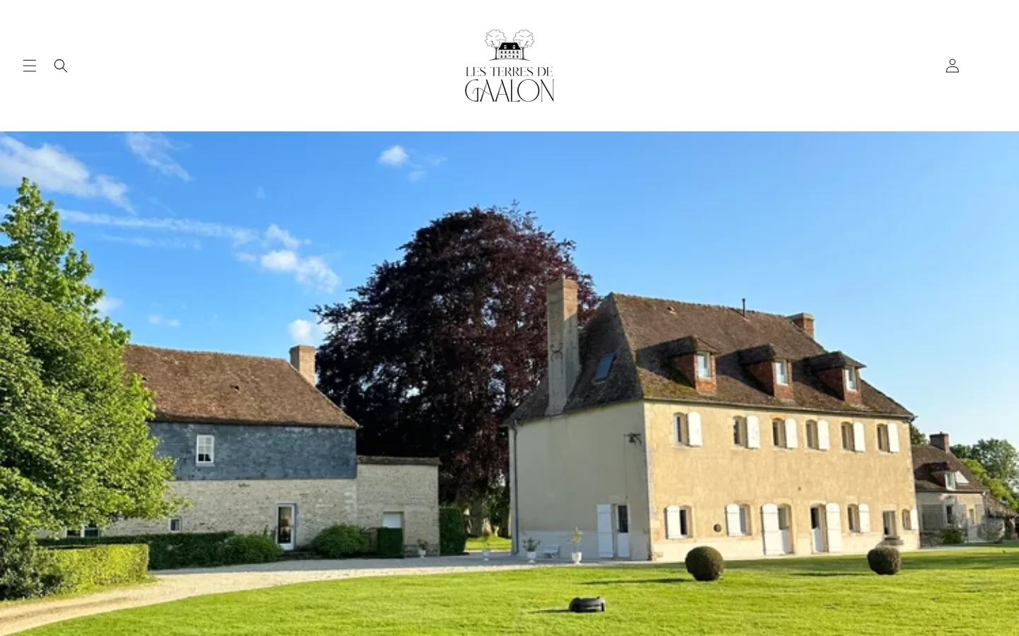
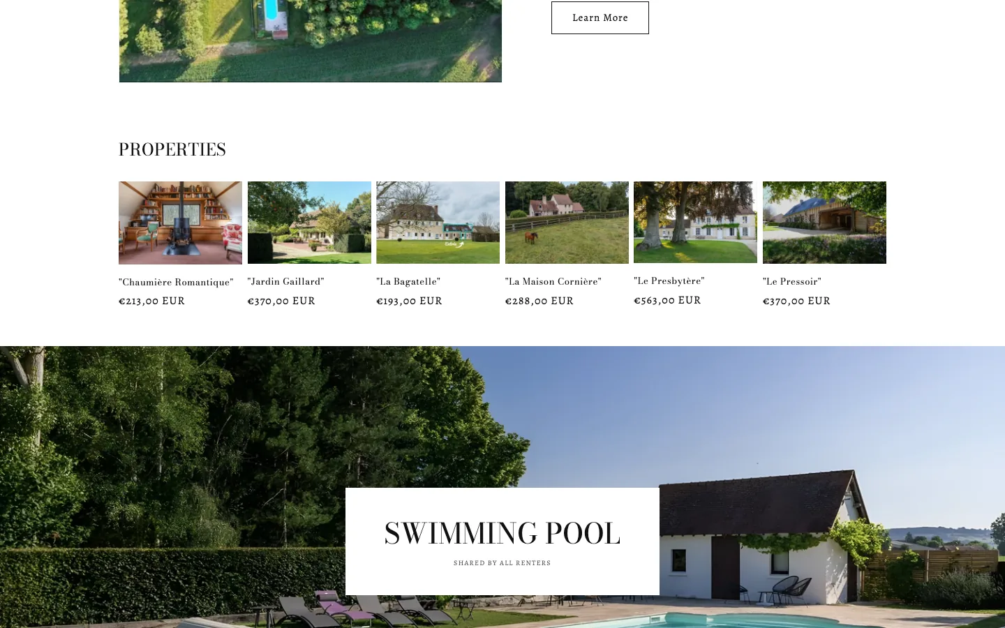
The historic public website works as a Shopify store: static image, Book now button, search, account and cart controls, plus six properties with public prices. The redesign brings the estate, its history and its uses back to the centre of the experience.
ART DIRECTION
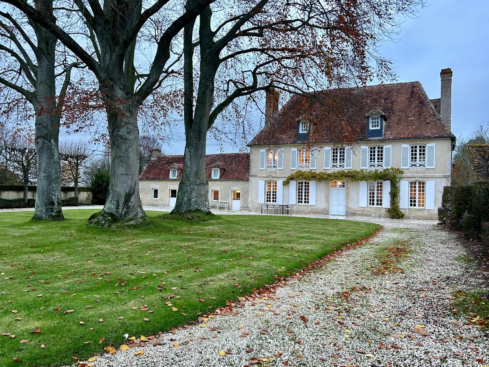
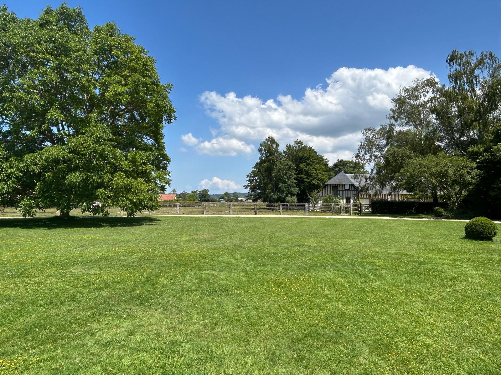
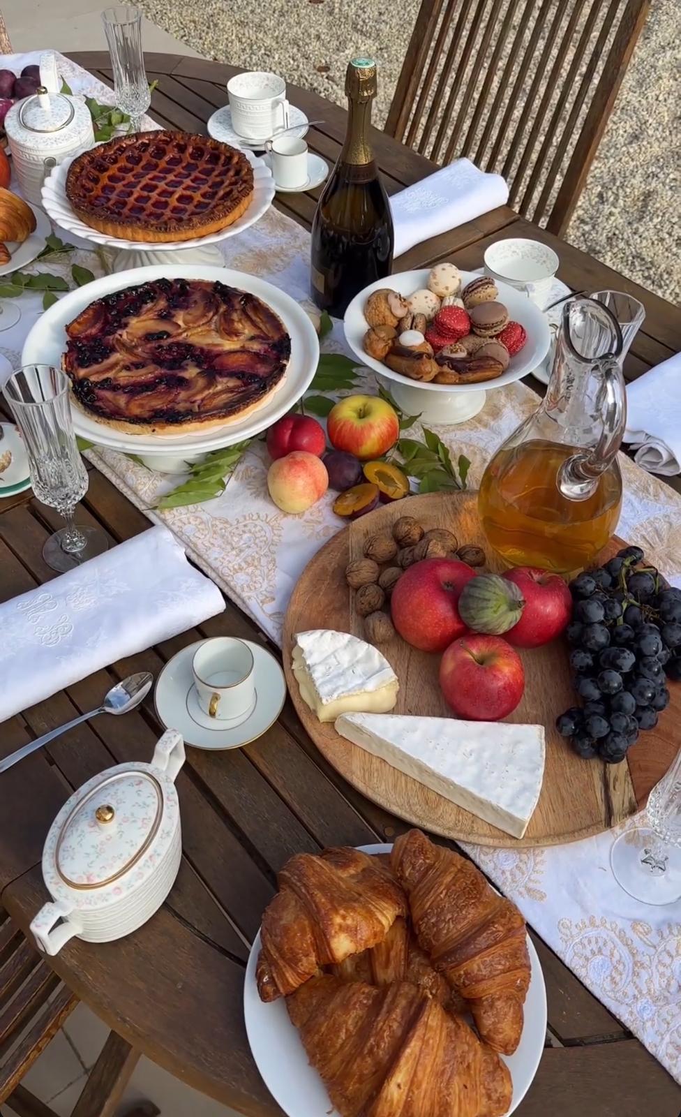
I kept the supplied logo without redrawing it. Estate photography became the material for the moodboard: pale stone, vegetation, a laid table and the surrounding land. The web version narrows the palette to three tones, with Newsreader for large headings and DM Sans for body copy.

CINEMATIC SIGNATURE
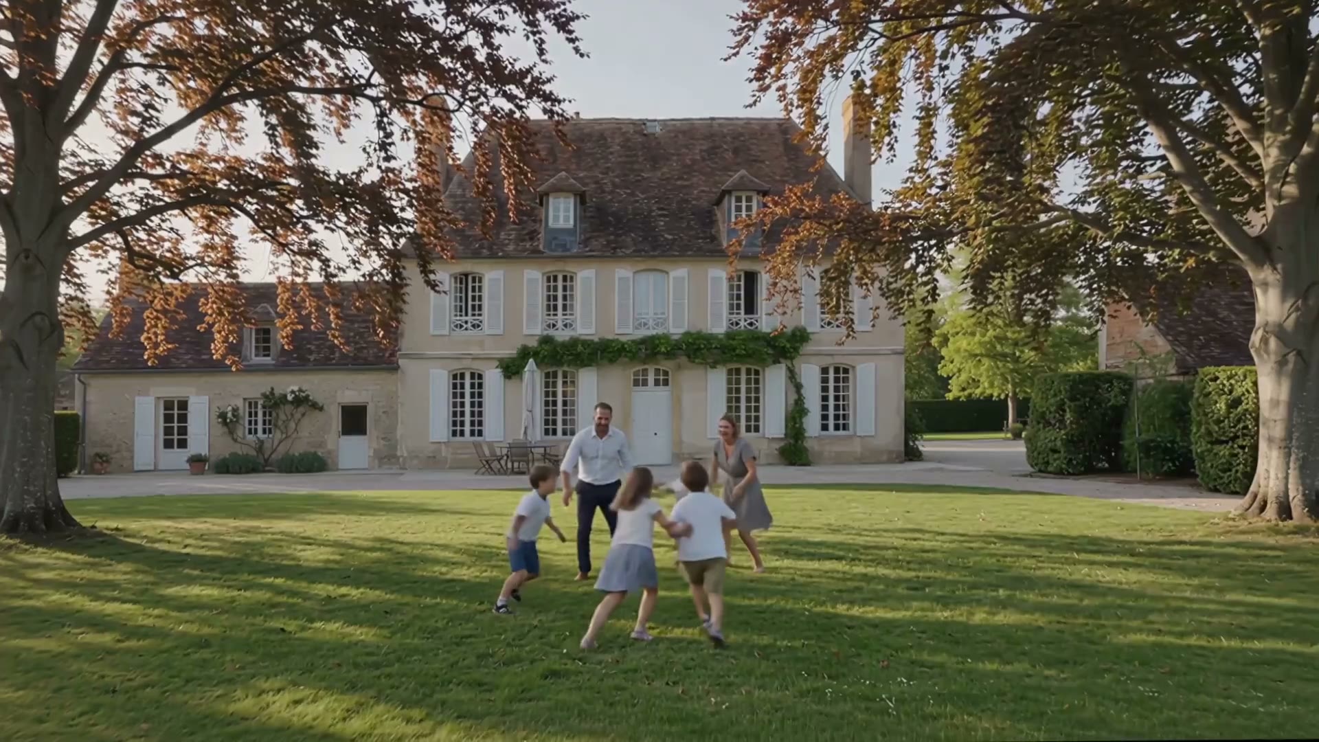
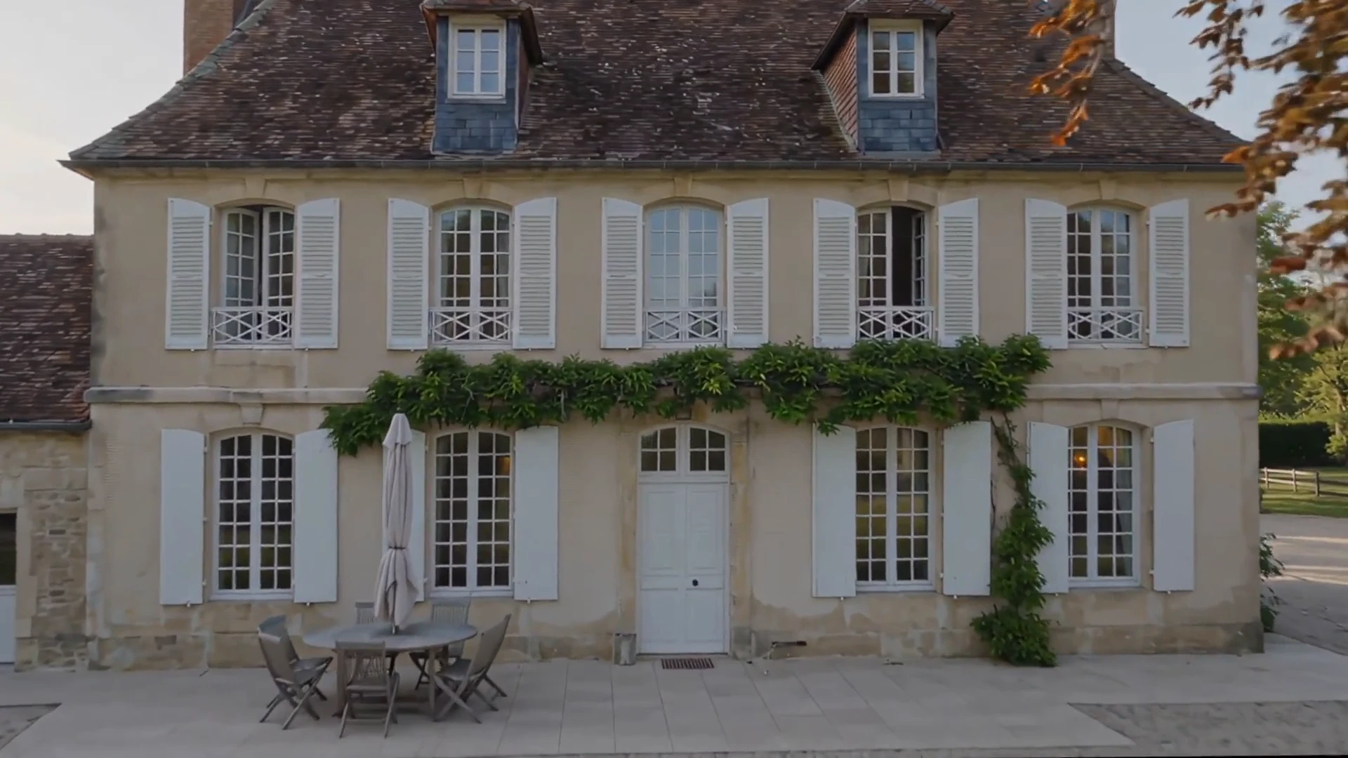
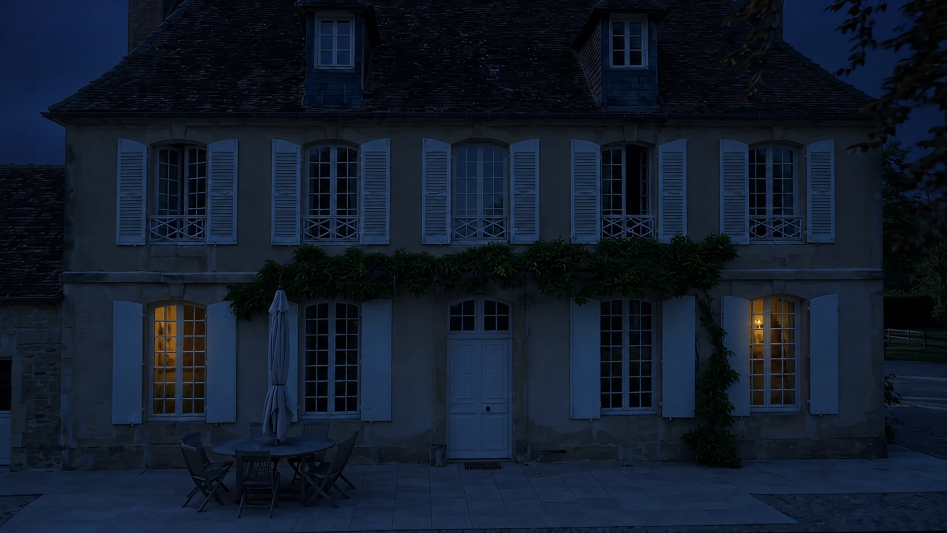
The hero uses an AI-generated sequence shaped like an opening shot. The camera approaches the house, stops on an exact frame and lets night appear without breaking the composition.
One playthrough, one final frame and a continuous transition from day to night.
JOURNEY
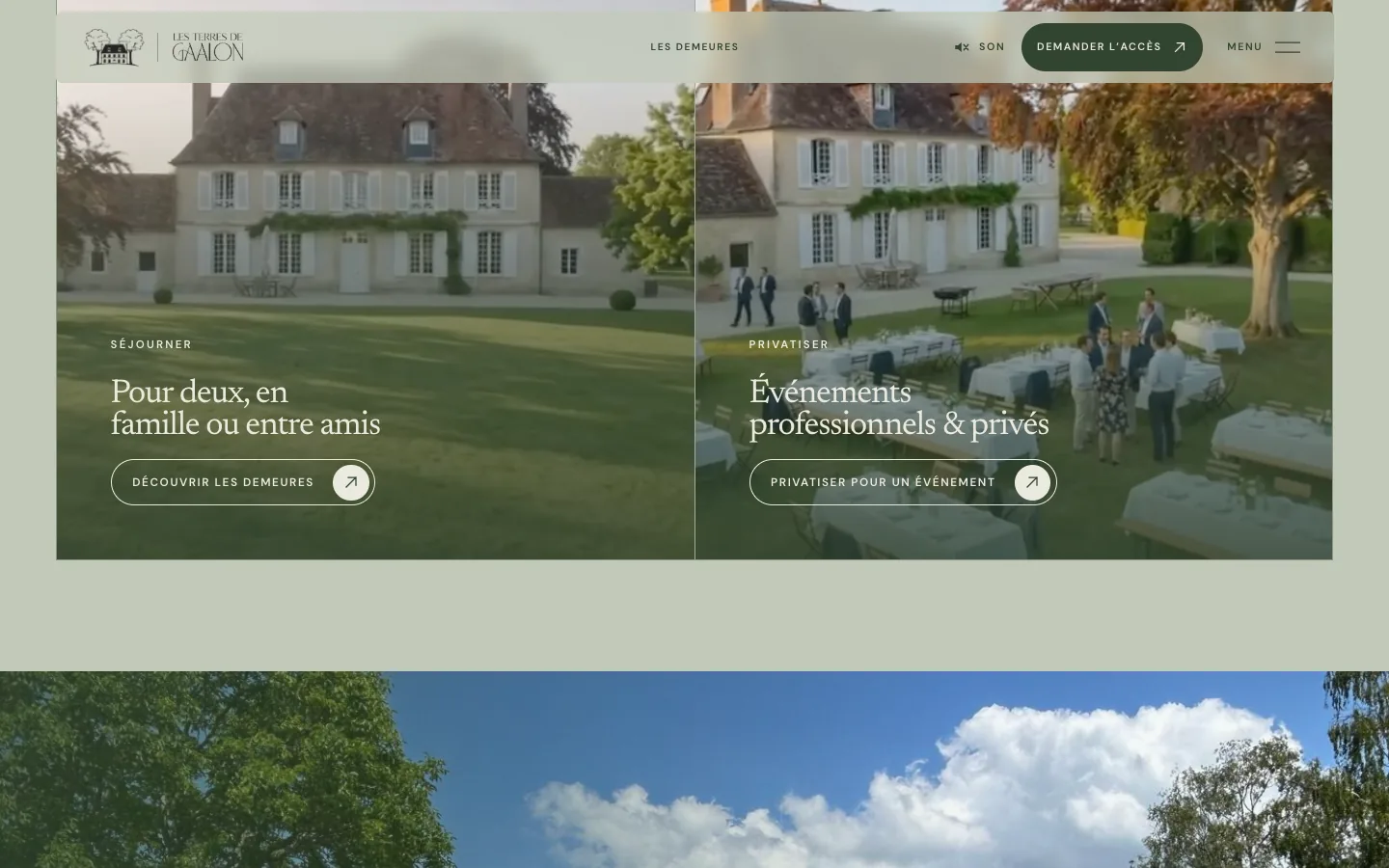
Stays and private events become two clear entry points. The dwellings, territory and journal then deepen the discovery of the estate before leading to the access request.
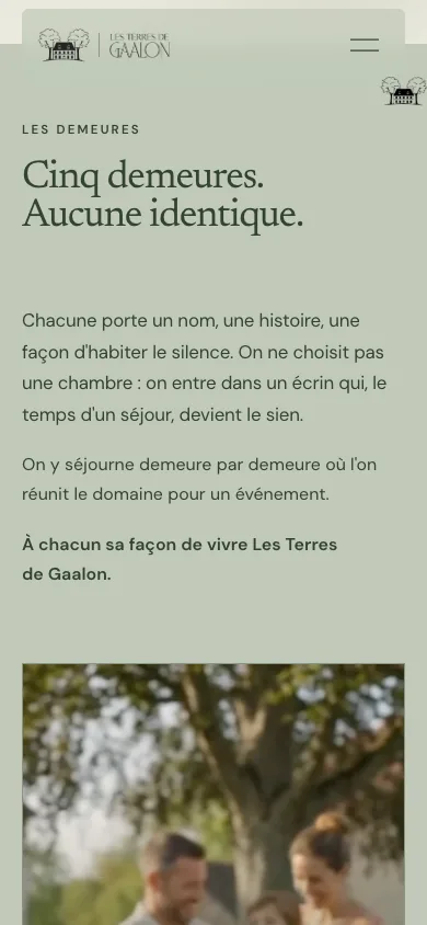
05 / BEFORE AND AFTER
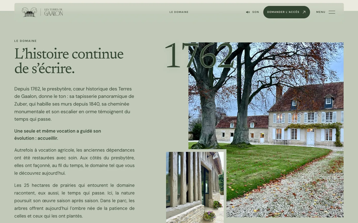
The comparison is not only about style. It shows the shift from a rental store to a brand story organised around stays, private events and requesting access.
Current live website
lesterresdegaalon.comMy redesign
terres-de-gaalon-v0.vercel.app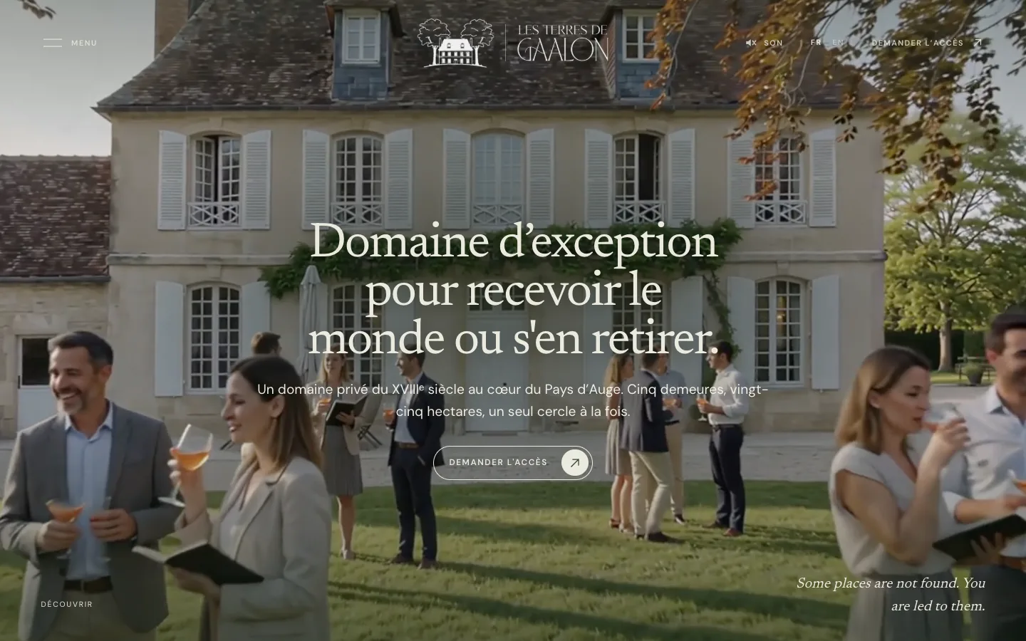
06 / SITE STRUCTURE
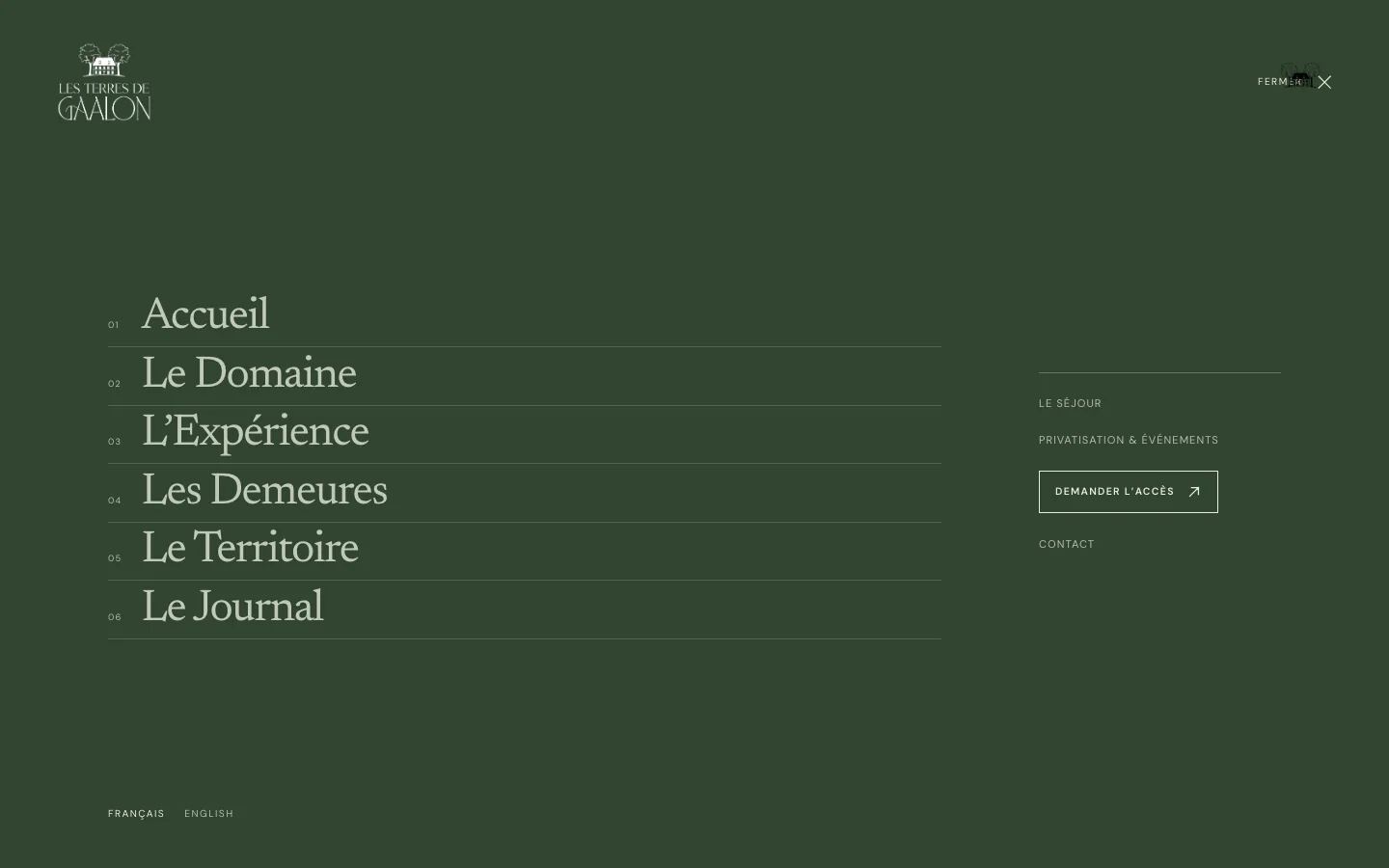
The structure follows the way people discover the estate: understand the place, choose an intention, explore a dwelling, then get in touch.
Editorial structure
Story progression
Enter through the estate, its history and its territory.
Move towards a stay or a private event.
Enter the distinct story of each dwelling.
Move from discovery to direct contact.
07 / Design decisions
The supplied logo is used without redrawing it. The web system focuses on ivory, sage and deep green, with Newsreader and DM Sans providing editorial continuity.
The video does not loop. It approaches the estate, stops on its final frame, then reveals a night version of the same view through one continuous transition.
The cart and immediate booking disappear. The site establishes the place, helps visitors choose between a stay and a private event, then leads to a form of contact aligned with the estate’s positioning.
08 / Delivery
The new experience makes the place its guiding thread: a cinematic arrival, distinct journeys and an access request in place of the cart.
Capabilities